User:Juxn~usabilitywiki/ruLogo
Hi,
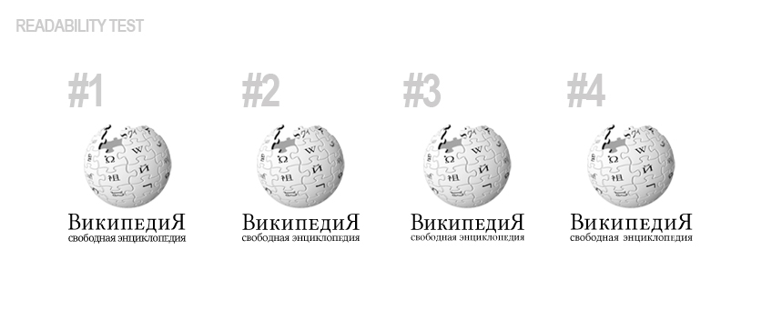
I need some help with designing the new typography of the russian logo for Wikipedia, because I cannot estimate the readability of the cyrillic letters. If you speak russian: please help me and leave a comment on this page. My main questions are:
- Is the word "WikipediA" readable?
- What about readability of the descriptor ("The free Encyclopedia")?
- Do you see any advanteges in these (slightly) different versions? (they only differ in the typography of the descriptor)
- Are the words correct? (I used google translate to get these cyrellig letters, but the current Wikipedia logo on ru.wikipedia looks a bit different to mee.)
Thank you for any feedback!
Comments
Please leave your comments here


