Babaco Designs
Appearance

We welcome your constructive feedback. Please use the Discussion page for all of your comments.
Tabbed Navigation

Motivation
- Introducing tabs that can be used within content generation dialogues and a right column.
- The active tab should be a part of the page.
- Emphasizing special functionality of tabs --> For example: The Edit link is unique and very important. It's different from a link in the left nav (like "Help" or "Mainpage") so it should look different.
- Achieve consistent design
Approach
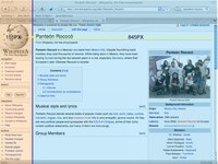
- Real tabs (not open at the top).
- Rounded corners
- Gentle gradient background
- Blue background indicates a link
- Gray background (="empty tab") and red link indicates a not existing page
Layout

Motivation
- Take advantage of horizontal screen real estate without sacrificing readability page/article contents
- Create space for contextual editing tools on edit pages only
- Design layout of right navigation bar for possible inclusion in all Wiki pages.
- Achieve a more predictable layout
- Improve readability of article content without alienating any particular browser/screen configuration of our users
Approach
- Fixed width left and right columns
- Elastic content column
- Accommodates users with smaller (800X600) screens and is ideal for our users average screen size
- Right column only exists on edit pages.
Color Scheme

Motivation
- Add more visual cues for page navigation, points of interaction, action, selection, etc.
- Carefully use color for emphasis of page, tabular, and organizational structure.
Approach
- Maintain historical consistency with wiki colors - blue for links, red for yet-to-be-started pages, yellow for selection - in a unified color palette.
- Maintain sitewide consistency with colors across different pages.
- Use more readable and differentiable colors. I.e. the dk. gray tested by many online newspaper sites. Use highlight, selected, dynamic, or static cue colors when appropriate.
- Introduce color only as needed to solve specific navigation issues.
Toolbar Upgrades: Icons

Motivation
- Improve comprehensibility
- Achieve consistent design
Approach
- Adapting Gnome-Icons
- Monochrome and simple in color treatment
- Gentle shiny "button" style
Resources
- Learn how to make a "Bold" or "Italics" icon for your language here.
Toolbar Upgrades: Button Interaction

Motivation
- The current toolbar has a singular mode of interaction
- We want the buttons to reinforce selection: This reinforces the user's sense of it being "click able" and their mouse selection.
- We want it to reflect state: If my cursor is in a section that is already bold, it would be beneficial to have the toolbar/buttons convey this.
Approach
- Add mouse over behavior to toolbar buttons to improve interaction and experience.
- Explore the possibilities of the syntax highlighting/development necessary to enable the toolbar with 2-way interaction.
- If possible, add "selected" look and behavior to toolbar buttons.
Toolbar Upgrades: Dialogs
Motivation
- Make it as easy to add links, images, references as it is to add and format text.
- Allow users to create and insert these without needing to know wiki syntax
- Create an intermediate between rich-text and wiki syntax for special insertions: links, references, media, tables

Approach 1
- Create dialogs that can be used for insertion, but that can also be used for editing those links, references, etc.
- Be as smart and give as much feedback to the user when creating/inserting these elements
- Achieve consistency of interaction across all dialogs.

Approach 2
- Unified UI for internal and external links using software to guess the intention of the user, but still allow the user to force the link to be internal or external
- Give feedback for internal links as to whether the link is to an existing page or not
- Greatly simplify the options for tables
- Provide a preview of what the table will look like

Insert table dialog
Please visit Sandbox3 to test the dialogs.
We are not sure about the preview
- Because it does not reflect the table dimensions
- It reflects tableborder, sortable table amd header row only
- People might want to edit this preview-table, which is not possible. Therefor the preview should be named "Example" and should look not editable. (See mockup #1 - #2)
- Maybe it is a wiser decision not to show this preview/example at all. (See mockup #4)
Editing Interface Improvements

Motivation
- Users got lost while previewing
- Users did not consistently locate and make use of the terms of contribution, edit summary, minor edit and watch controls
- Users with different sized screens may wish to adjust the size of the table of contents or even hide it completely
- Many users were not fully aware of the effects of clicking save (you've now changed Wikipedia!)
Approach
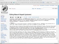
- Make preview a mode of the editing interface activated with a set of tabs
- Only show terms of contribution, edit summary, minor edit and watch controls when a user clicks the publish button using a modal dialog.
- Add hide and show control for the table of contents as well as drag-and-resize grips on the left side of the table of contents and a grip icon at the bottom.
Table of Contents + Help

Motivation
- Allow users to navigate the editing of the article as they do the article itself.
- Give users a sense of where they are (or rather, their cursor is) in the structure of the article.
- Possibly provide help in this right column real estate as well.
Approach
- Dynamically laid out table of contents.
- Jumps to section on click
- Scrollable.
- Highlights current section.
Beyond Babaco
Some early designs looking forward past the Babaco Release.
Left Navigation
Full Screen Edit Mode

Motivations
- More screen real estate for editing tools and help
- A more "defined" editing process and space
- Simplifying the editing experience by removing less useful links and navigation.
Approach
- Use left and right columns for non-toolbar editing tools
- Keep main sitewide navigation
- Remove less relevant sitewide links
Messages

Motivation
- Prevent messages on discussion pages (as well as article pages) from overwhelming users and distracting from the content.
- Prevent messages from taking a full screen of real estate - obscuring content.
- Give users control for how they view, show, hide messages.
Approach
- Make messages collapsible
- Provide toggle to show and hide messages
- User right column for messages on article pages?
- Ranking system for message type?
Discussion
Motivation
- Users were not able to easily identify the timeline of discussions
- Users had trouble knowing where to contribute to the discussion
- Users often did not know how to, that they should, or simply forgot to add a signature
- Processes like Featured content and deletion candidates must have complex templates and be managed manually
Approach 1

- Made posting isolated, as opposed to editing entire discussion
- Enforced structure of discussion to represent threading and order
- Posts are always signed automatically
- Enable users to watch only their discussion
- Set default parameters and structure automatically
- See also strategy:Proposal:Stop using wikis for tasks for which wikis are not suitable
Approach 2

- Integration of reply and internal link views into the post they are in relation to
- Avoid obscuring information with the toolbar
