Text format icons
Background
The Usability Team strives to design their icons to be as cross-culture and cross-language friendly as possible. The 'Bold', 'Italics', and other character formatting icons proved particularly challenging. In the end, we have decided our favored approach is to support and use language-specific icons for the 'Bold' and 'Italics' buttons (making them more intuitive, easier to identify and use), but to design these in a manner that they can be easily generated in other languages. We have started off with the 5 languages with the largest wikis: English, German, French, X, X. These alone should work for many closely related languages. If an appropriate icon for your language is not present in the set, you can follow the instructions below to create the icons for your language. We both encourage and would greatly appreciate your efforts. Please also add your work to the growing set so that others do not have to duplicate your work.
We encourage people to use the icons we have provided for the size and baseline character formatting. We have used the latin letter 'A'.
We have created these icons using the Droid font family. It was developed by Ascender in fall of 2006 explicity for Google and the Open Handset Alliance for use on the Android platform. It was designed for on-screen readability and is licensced under the Apache license. The collection provides an extensive set of styles (including bold and italics of course), weights, and language support (including Western and Eastern European Languages, Cyrillic, Greek, Turkish, as well as glyphs for Chinese, Japanese, and Korean).
This is a tutorial on how to create language specific bold/ italic icons for our toolbar. Take a look at icons that have already been created before you start to create one yourself. When you have succeeded to create a new icon please contribute it to this page on Wikimedia Commons.
This page offers a tutorial using Adobe Illustrator and Photoshop and another one using the Opensource applications Inkscape and Gimp.
The result should be similar, no matter which applications you prefer.
Finally: Please check to see whether your icon looks similar to universal ![]() and
and ![]() icon. If you have any problems you are welcome to ask for help on the discussion page.
icon. If you have any problems you are welcome to ask for help on the discussion page.
Using Adobe Illustrator + Photoshop
Preparation
| Before you begin |
|---|
| Download and install the Droid Serif (bold and italic) font. It is available for free download at fontsquirrel or at damieng.com |
Illustrator
Photoshop
| Switch to Photoshop | |
|---|---|
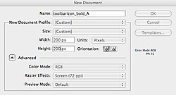
Create a new file.
|
|
Paste your icon.
|
|
Resize to 14 px.
|
|
Add effects.
|
|
|
Duplicate this layer.
Edit the properties of this layer:
|
|
|
Go to layer properties of this new layer.
Delete Effect: "Bevel & Emboss"
|
|
Delete the white background layer.
|
|
| Go to Image/ Canvas Size and set it to be 22px*22px. Position the letter in the center. | |
| Save this file as a png(-24). Please note the Naming Guidelines |
You are done! Please add your icon to this page on Wikimedia Commons and the Gallery below, so others need not duplicate your hard work!
Using Inkscape + Gimp
Preparation
| Before you begin |
|---|
| Download and install the Droid Serif (bold and italic) font. It is available for free download at fontsquirrel or at damieng.com |
| Download and install the gimp plugin layer effects |
Inkscape
Gimp
| Switch to Gimp | |
|---|---|
| Open the normal.svg file you just created in Inkscape | |
Create new layer (this layer is only for your convenience, it will be deleted in the end)
|
|
| Make sure the layer with the letter/icon in the layer dialog is selected. Click on "bevel and emboss" (from the main menu bar, go to Script Fu → Layer Effects → "Bevel and Emboss") Change these default values:
|
|
| Scale image down to 14px height & width (From the main menu bar, go to Image → Scale Image Interpolation: Cubic |
|
Add a stroke. From the main menu bar, go to Script Fu → Layer Effects → Stroke
|
|
| Delete white background layer
(Select background layer in layer dialog, then click on the "Delete this layer" Trash icon to delete it) | |
| Go to Image/ Canvas Size and set it to be 22px*22px. Position the letter in the center. | |
| Save as png. Please note the Naming Guidelines |
You are done! Please add your icon to this page on Wikimedia Commons and the Gallery below so others need not duplicate your hard work!
Naming Guideline
Please upload your Icon to this page on Wikimedia Commons and name your file like this:
"toolbaricon_" + "bold_" or "italic_" + the actual letter + fileformat (".png")
Example: For this tutorial the file would be named:
"toolbaricon_bold_F.png"


